Gray News is full of cheesy clip art
Newspapers are supposed to inform. They do this through words- the articles and captions, they do this through photographs and other visuals, like illustration and cartoons. Everything in the paper is supposed to perform a function, wasting space is not a good design option.
A carefully balanced and good looking paper will attract the reader without the reader knowing why. The design is not supposed to be so good that you notice it instead of the news, and the design is not supposed to be so bad that it's all you notice and it's repellent. The Gray News falls in the latter category.
One of the reasons the Gray News looks (and is) outdated, is that they are sadly committed to using clip art. Clip art is the cludgy, cheesy looking baskets of flowers or turkeys at Thanksgiving you see in their masthead. To put together the paper, they print it out, cut it into strips, which they lay on the layout sheets (in itself, outdated. Everyone's electronic now). Then when they reach the bottom of the page, they actually cut the strip and lay it atop the next column. Where they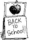 end, if there's white space, that's where they stick clip art. Left, look for this kind of clip art in upcoming issues.
Anne Van Wagener is Design Editor / Adjunct Faculty at the Poynter Institute, an education organization for new and working journalists. Here's her take on clip art:
"The use of the word 'art' in clip art is far too prestigious a word to explain these lowly images. Let's just say I'm not a big fan of clip art. Especially when it comes to news design because more often than not someone is just sticking it on a page to pretty it up or to fill space. And I'd rather have no image than a bad one. The majority of clip art out there looks dated, and cheesy. It's clip art, and it's as ugly as homemade sin. Visuals project the quality, sophistication, and personality of a publication or website, and they are the first thing that attracts the reader's eye."
When the Gray News comes out Friday, look for the cheesy clip art, it makes the paper look cludgy and uninteresting. Look for the ads that have strands of black around them- that's where they have laminated it and used it over and over again, sticking it on the waxed layout pages every week. To fill white space at Thanksgiving time, why, it's turkeys, of course!.
A newspaper should use all its space to advantage to inform- not to repel the reader with cludgy turkeys and valentine hearts like a fourth grade art poster project. A heightened bar of design would make the paper more readable. Those turkeys are a perfect emblem for the Gray News approach to presenting the contents of their newsletter.
A carefully balanced and good looking paper will attract the reader without the reader knowing why. The design is not supposed to be so good that you notice it instead of the news, and the design is not supposed to be so bad that it's all you notice and it's repellent. The Gray News falls in the latter category.
One of the reasons the Gray News looks (and is) outdated, is that they are sadly committed to using clip art. Clip art is the cludgy, cheesy looking baskets of flowers or turkeys at Thanksgiving you see in their masthead. To put together the paper, they print it out, cut it into strips, which they lay on the layout sheets (in itself, outdated. Everyone's electronic now). Then when they reach the bottom of the page, they actually cut the strip and lay it atop the next column. Where they
 end, if there's white space, that's where they stick clip art. Left, look for this kind of clip art in upcoming issues.
Anne Van Wagener is Design Editor / Adjunct Faculty at the Poynter Institute, an education organization for new and working journalists. Here's her take on clip art:
"The use of the word 'art' in clip art is far too prestigious a word to explain these lowly images. Let's just say I'm not a big fan of clip art. Especially when it comes to news design because more often than not someone is just sticking it on a page to pretty it up or to fill space. And I'd rather have no image than a bad one. The majority of clip art out there looks dated, and cheesy. It's clip art, and it's as ugly as homemade sin. Visuals project the quality, sophistication, and personality of a publication or website, and they are the first thing that attracts the reader's eye."
When the Gray News comes out Friday, look for the cheesy clip art, it makes the paper look cludgy and uninteresting. Look for the ads that have strands of black around them- that's where they have laminated it and used it over and over again, sticking it on the waxed layout pages every week.
 To fill white space at Thanksgiving time, why, it's turkeys, of course!.
A newspaper should use all its space to advantage to inform- not to repel the reader with cludgy turkeys and valentine hearts like a fourth grade art poster project. A heightened bar of design would make the paper more readable. Those turkeys are a perfect emblem for the Gray News approach to presenting the contents of their newsletter.
posted by Gray Maine at
2:50 PM
![]()

4 Comments:
Aged and time to retire, Ray start enjoying life, let go. it's time, we all know it. Many people at your age have difficulty, we understand that. Let the borad renew itself...show it has the ability to update itself...renew it's commitment to REPORT the news, noit make it up.
By Anonymous, at 8:08 PM
I Agree! Ray Clark {and Nathan Tsukroff} serve no purpose in this Town; and need to Retire somewhere else! The GN is past recovering! Thanks to these two people.
By Anonymous, at 9:25 AM
If Jon Barton hadn't passed away this week there would have been no news in the paper. It's worthless!
By Anonymous, at 7:04 PM
There is seldom real news in the GN. Under the pretense of news there are inaccurate and even false statements of fact, reports with opinion and plagarism. At one time the GN had some value if an acquisition opportunity came forward but now it is worthless. The piper led the directors off the cliff. Too late you directors; you can't save face now.
By Anonymous, at 7:23 PM
Post a Comment
<< Home